Wednesday, June 29, 2011

Gallery Walls

A home is not a home until I have covered every bit of wall space with pictures, wall art and family photography.  This drives my better half bonkers; he has that whole architect/minimalism thing down pat.  When I asked him what he thought, his reply was, "I like the wall color you picked."  Gah.

I started with a fresh coat of Dunn Edward's Wells Gray, a nice, neutral, mid-tone, warm gray with green undertones.


I have a rather large collection of frames so I needed to decide what I wanted the wall to look like.  In the past I have used all black frames and displayed them in a grid.  I wanted the gallery to look less matchy and more eclectic, with a mix of vintage and clean lines and a mix of neutral colors such as black, white, cream and gray.  I also wanted to use what I had and not make any new frame purchases, because frankly, I could open a frame store with the volume of frames that I own.

Since most of my stock of frames is black, I chose some of the frames to paint using RustOleum's Heirloom White spray paint.

I spent a couple of hours laying them out on the floor until the mix was balanced. Pay no attention to the lovely peach carpet from the 80's!


I no longer hang pictures with a hammer and nails, I am using 3M Command Hanging strips.  They are fast and easy and, no more holes in the wall.

Here is the end result.  I have a bit of tweaking to do until it is just right.  The next project is adding furniture!


 This print I purchased from Etsy.  The print is titled, The Sweet Life.


The print is from the same Etsy shop as the print above.  The old crate is a flea market find.  The framed nest is from FOUND.


My wall art inspiration comes from Laura Winslow's Wall Art Wednesday blog posts.  Thank you Laura!

So friends, what do you think?

Thursday, May 26, 2011

An amazing color discovery

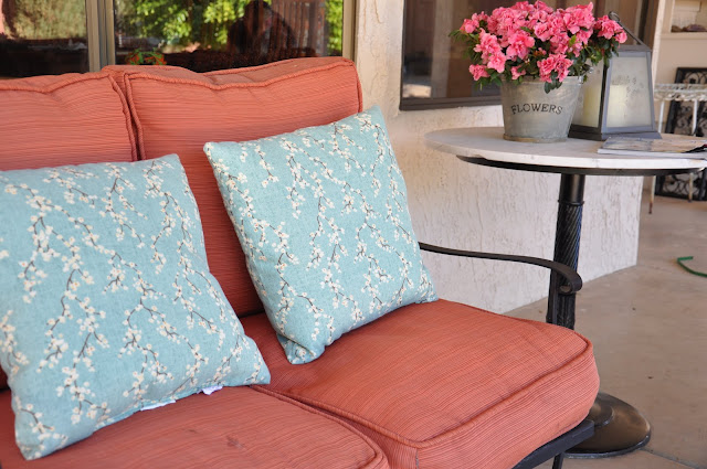
I have had this iron patio set with the rust cushions for 7 years. I really want to recover the cushions to go with my updated palette of creams and grays, a touch of black, and aqua blue.  My budget, however, is not agreeing with my decor plans.

How can rust work with my new colors?

I found these two (alas, only two) outdoor pillows on clearance at Home Depot.  The background is a muted blue with a floral pattern that has just a touch of rust!


Today, Nester's post on her Salvation Army find affirmed my amazing color discovery and now I am happily putting off the upholstery update until next summer.


Here is a great photo I found on Pinterest featuring aqua and rust (real rust even!).

Friday, May 20, 2011

A taste of Swedish Vintage on Layla Grace

I have to share this beautiful blog post from Layla Grace featuring one of my favorite flavors of vintage style, Swedish Vintage.

I have linked many of Layla Grace products on my Pinterest boards, and I love seeing the look captured so beautifully in these vignettes!

Tuesday, May 10, 2011

Finally time for a laundry room redo!

Recently as I was blog hopping, I came to a blog posting at Belle Maison covering the most beautiful laundry room decor I have ever seen.  It really started the creative juices flowing on a laundry room redo of my own.  I found this laundry room redo covered at one of my favorite blogs, House of Turquoise, and knew what my next project was going to be.


Now, I just needed a laundry room to make beautiful!

After a month of moving into a new home, it was finally time to get the party started.  My hubby and I are the happy parents of three boys, therefore, I spend a lot of time in my laundry room.  I really wanted the space to be a beautiful extension of other parts of the house that for some odd reason, grab all the attention (the family room, our bedroom).

This is what it looked like before the makeover:


I am stuck with the dark oak cabinets, but, it is amazing what just a few, inexpensive details add to the space. First, I installed my front loading washer and dryer. The simple chandelier came from Home Depot and the two black and white rugs I picked up from Target.


The most important addition was painting the walls.  I chose Benjamin Moore's Jamaican Aqua.


This color is in the House Beautiful Colors for Your Home book, and has been a popular color for a couple of years.  I love this color so much I used it in my closet too.  :)

Wednesday, May 4, 2011

COCOA&HEARTS

I have been following a blog called Made by Girl for a while now.  The author is Jen Ramos and she is now following one of her artistic passions and making the most beautiful paintings.  She developed a website called COCOA&HEARTS to sell her work, and almost all of her first batch of paintings are sold.

I fell in love with this beautiful piece, and I will definitely be on the look out for more works!

Tuesday, April 5, 2011

An old bench finds new life!

This bench glider has been out in my yard in the elements for almost 5 years.  It was there when we bought the house, and it was in a terrible state of neglect.  I decided to clean it up, give it a makeover and use it for seating on my patio.

After scrubbing the bench I used a rotary sander and sanded down the slats.  There were a few missing nuts and bolts that I matched and replaced, using Loctite to keep them from becoming loose.


To make sure any painting I did would last, I sprayed the metal and wood with Rustoleum Primer.  A day or so later, I sprayed the bench with Rustoleum glossy black spray paint.  We had a few windy days which delayed the project.


I finished up the bench with a new cushion which I had a friend upholster in a black and white Sunbrella fabric. Adding a few decorative pillows from Pier One completed the project!


The bench went from neglected to fabulous, and the project cost less than $70!  And, I love it!

Wednesday, March 30, 2011

Closets are coming out of the closet!

I came across a few beautifully decorated CLOSETS today and had to share (yes closets).  I have a hard time with the common areas of my house, much less thinking about how my closets look.  But, I know I feel better when I look in my closet and it is clean and organized.  It makes me happy to start my day able to find all of my stuff instead of last minute searches for clothes and accessories.

I do not think the following beautiful closets are everything I dream about. For one thing they most likely cost a fortune to design.  However, what I really love about them are things that I can add that won't break the bank.

The things I really love about this first example from CocoCozy is the natural light and the chandelier.

DRESSING IT UP!


I can say the same thing about this closet from Canadian House and Home!


I LOVE the color in this dressing room from Apartment Therapy:


From Adore Vintage Home Blog I see a puppy I could instantly fall in love with, and along with him (or her!) I love the color in the rug, the chandelier and the natural light yet again.


What are the two or three things that catch your eye in multiple spaces?  Think of a way to bring those items in to your space with out a complete redo of the space.

I will be re-thinking my own closet in the next few months!